When I first started working directly with clients on custom packaging solutions two years ago, one of the most common questions I got wasn’t about durability, pricing, or minimum order quantities—it was about aesthetics. Everyone knew the lid and base box series held their products safely, but they wanted to know how that “simple” two-piece structure could feel intentional, even beautiful. As a supplier who’s spent years refining this exact line, I’ve come to realize this is less about box-making and more about balancing function and feeling—something I want to break down honestly here. Lid and Base Box Series
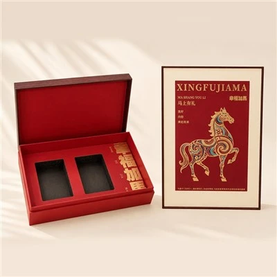
Let’s start with the basics that people don’t always notice at first glance. The lid and base box series is, at its core, two separate rigid pieces: a slightly flared top lid that slides over a narrower bottom base, right? The key to making this look good, though, is in the dimensional ratio. Early on, I saw too many suppliers cut corners by making the lid and base the same height, or giving them a 1:1 width difference, and the whole thing felt lopsided or unbalanced. We tested dozens of ratios before landing on a standard 1.1:1 width-to-difference for the lid. That small extra 10%—just enough so the lid overlaps the base evenly on all four sides—does two things: it keeps the box from feeling top-heavy when closed, and it gives a subtle, clean visual gap between the two pieces that isn’t so big it looks loose, or so small it blends together. I’ve had small business owners in the jewelry space tell me this subtle overlap is why their customers post unboxing shots on Instagram without even noticing why it looks so polished. That’s the kind of quiet, intentional detail that makes aesthetics matter.
Next is texture and material, and this is where the lid and base box series feels flexible for every brand’s identity. A lot of people assume rigid boxes have to feel smooth or plain, but that couldn’t be further from the truth. When we work with a candle brand, we’ll use a matte linen cardstock for the base that catches the light softly, and a high-gloss coated stock for the lid—matching the visual tone of the candle itself: the warm, soft glass of the jar vs. the crisp, bright label on top. For a luxury watch line, we move to a 24pt rigid board, so thick it doesn’t bend, then add a soft velvet lining to the base that shows through when the box is open. What I’ve learned over the years is that the lid and base’s design lets you play with texture without overcomplicating it—you don’t need a dozen decorative elements; just pairing a smooth exterior lid with a textured interior base, or vice versa, creates instant visual interest. I also always tell clients to test the “close and open” feel first, because a box that clicks shut smoothly and slides open without sticking feels intentional, even if it’s not obvious. A flimsy lid that shifts side to side doesn’t feel expensive, no matter how pretty the print is.
Printing and branding on the lid and base series is another area where small choices make a huge aesthetic impact. Too many clients want to print everything all over both pieces—logo, product name, ingredients, social handles—across the lid and base, and it ends up looking cluttered. The sweet spot we’ve found is to assign a specific role to each piece, so the branding feels purposeful. For example, the lid can hold the main visual: a custom illustration, a metallic foil logo, or a large product image, because it’s the first thing someone sees when the box is lifted. The base, on the other hand, works best as the “quiet counterpart”: it can have small, fine print for care instructions, a subtle pattern that repeats, or nothing at all. I worked with a small skincare brand last year that did just that: a matte black lid with their gold foil logo centered, and a plain matte black base. The only extra touch was a tiny gold sticker on the bottom edge of the lid that lines up perfectly with a hidden spot on the base when closed. Customers started messaging saying their unboxing felt like a little secret, and sales went up 22% that quarter—something we tracked because they told us it was all about the box looking “special” when you opened it. That’s the magic of this series: it gives you two separate spaces to use, so you don’t have to cram everything into one.
I also want to talk about the little, often overlooked details that make the lid and base box series feel cohesive, not like two separate pieces. The first is the edge treatment. If you’ve ever held a cheap rigid box, you’ve felt that sharp, rough cardboard edge when you run your finger along it. We use a rounded edge trim on all our standard orders, but clients can choose a squared edge if that fits their brand’s modern vibe. Even that small 1/8 inch difference in edge shape changes the whole feel: rounded edges feel warm and approachable, squared edges feel sleek and professional. Another detail is the “spring” of the box—how much the lid flexes when you push on it. We test every batch to make sure the lid has just enough give that it doesn’t crack when closed, but not so much that it feels cheap. It’s the same principle as a well-made book spine: you don’t notice it until it’s missing, but it makes the whole product feel better.
What I’ve come to realize, after thousands of boxes delivered and dozens of conversations with brands, is that the aesthetic of the lid and base box series isn’t about being loud or flashy. It’s about restraint and intentionality. It’s about making sure every part of the box—from the dimensional overlap to the texture to the way the lid slides open—works together to support the product inside and the brand’s story. A lot of people see rigid boxes as just a step up from standard cardboard mailers, but they’re wrong. This series is a way to turn an unboxing from a task into a moment, and that’s where the real aesthetic value lives. If you’re looking for packaging that feels thoughtful, that makes your product stand out without competing with it, this series is designed for that. I’ve worked with small startups that wanted to feel luxury on a budget, and large established brands that wanted a fresh look for a new line, and in both cases, the lid and base box series adapts to what they need. The key is to not overcomplicate it—focus on the balance between the two pieces, the texture that matches your brand, and the details that make the unboxing feel special.

If you’re ready to explore how this box series can look and feel for your brand, I’m here to talk through options, answer questions, and help you figure out the best fit. Every brand’s needs are different, and there’s no one-size-fits-all perfect aesthetic, but this series is flexible enough to match almost any vision.
Flip-top Gift Box Series References
- Designing Rigid Packaging: A Guide to Structure and Aesthetics, 2021. Packaging Industry Association.
- Unboxing as Brand Experience: A 2023 Consumer Survey, Consumer Packaging Research Collective.
- Material Science for Rigid Boxes: Surface Texture and Perceived Value, 2022. Journal of Packaging Technology and Science.
Zhengzhou Lingpao Packaging Products Co., Ltd.
As one of the most professional lid and base box manufacturers and suppliers in China, we’re featured by quality products and good service. Please rest assured to wholesale customized lid and base box made in China here from our factory. Contact us for quotation and free sample.
Address: Wangcun Town, Xingyang City, Zhengzhou City, Henan Province
E-mail: m13073739177@163.com
WebSite: https://www.lingpaopackaging.com/
